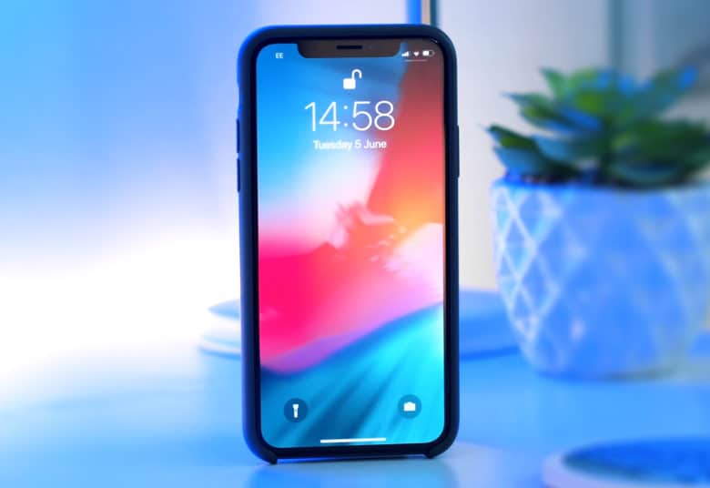
Apple’s next major iOS update, iOS 13, is expected to be released in June 2019 and we know that there are some important features that should definitely get the attention they need before this update rolls out. One of these features would be the iPhone lock screen, which is still causing some problems for Apple users. We’ve just came across a great design concept created by a 17-year-old for iOS 13, and judging by how it looks like, we could go as far as saying that it might be better than the one done in iOS 12 by the tech giant.
What’s wrong with the current iOS lock screen
The latest operating system from Apple, iOS 12, is grouping notifications by app at last. Users can also reply to messages straight from within notifications and it’s easier to mute notifications from each app than before. Nevertheless, notifications can still gather quite fast on the iPhone’s lock screen, just the same way they did in the past. So we can see why this can give users quite a headache and definitely needs to be addressed by Apple. In the meantime, a 17-year-old Reddit user, who has the username “whatfood”, has designed a lock screen for iOS 13 and posted a concept video about it online.
A much better way to deal with the notifications on the lock screen
The key thing in the mockup is a new music widget, which clearly seems to be better than Apple’s. However, what most of us are probably interested in is the new notification layout. So instead of having a never-ending series of text boxes, every single app that has unread notifications would be depicted by a small icon. If a user tapped on an icon, then the notifications would expand. This definitely looks like a great idea, as we would not have to deal with the chaos that the current iPhone lock screen creates.
Frances might be just at the beginning of her career, but after attending a technical school, she has a fresh perspective on today’s technology. She contributes to the site with tech news.

